

IMAGN Institute
Aesthetic surgery · Migraine surgery · Wellness · Barcelona
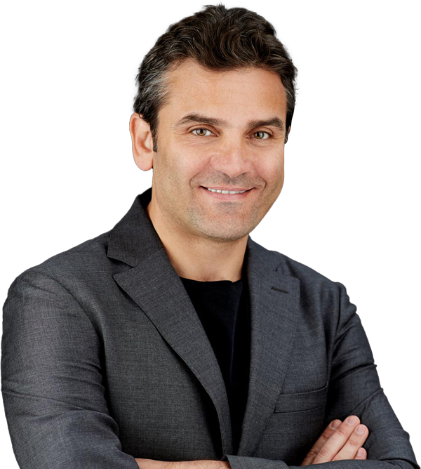
Dr. Ahmad Saad founded IMAGN Institute in Barcelona after years at leading clinics in the United States and Spain. The practice covers aesthetic surgery, migraine surgery, aesthetic medicine, and wellness — with High Definition Liposculpture and migraine surgery as genuine differentiators in the Barcelona market. His patient base is international, built over a career that spans two continents, and the practice operates in six languages to reflect it.
The brief
Opening your own clinic after a career built at established institutions is a specific kind of moment. The website had one job: carry the weight of that background while presenting something that was unmistakably IMAGN.
That meant establishing credibility without leaning on the institutions where Dr. Saad had trained and worked — they were context, not the point. The point was the practice he was building, what it specializes in, and why a patient in Barcelona — or Paris, or Moscow, or Riyadh — would choose it. Procedures like High Definition Liposculpture and migraine surgery don’t belong in a generic treatment menu. They need pages that explain what they are, who they’re for, and why this surgeon performs them.
The scope was clear from the first conversation: business name, brand identity, and website. Not a site to be designed into an existing brand. A practice being built from the ground up.
What was built
The studio’s involvement started with the name itself — IMAGN Institute.
From there: logo, business cards with QR codes linking directly to the site, and a website covering the full range of the practice. The visual language began with a direction from Dr. Saad — a bronze accent color — which the studio researched and developed into a complete visual system. The bronze runs through every page as the primary accent. The typographic system and layout proportions were built around the golden ratio, not as a stylistic gesture but as a structural principle.
The site runs in six languages: English, Spanish, Catalan, French, Russian, and Arabic. Each reflects a distinct part of Dr. Saad’s patient base. The Arabic version wasn’t a translation layered onto the existing layout — it required a full right-to-left structural redesign, rebuilding the position of every page element for a script that reads in the opposite direction.
Procedure pages are built for patients who arrive already informed and want to go further. Clinical detail, surgeon credentials, patient galleries, and FAQs — each page structured to give a patient who’s done their research what they need to decide.